
Days
Branding/
2025
Creative Duality
0
0
Photos
00
Countries
Creative Duality is a next-generation creative agency that builds real human connections for luxury brands. As it expanded across the U.S. and international markets, I designed its rebrand and website to give it a cohesive, premium visual system that matched its positioning.
The goal was a flexible yet distinctive identity that would reinforce the agency’s values, set it apart from competitors and strengthen its credibility in the luxury sector, while staying efficient across digital, corporate and experiential applications.
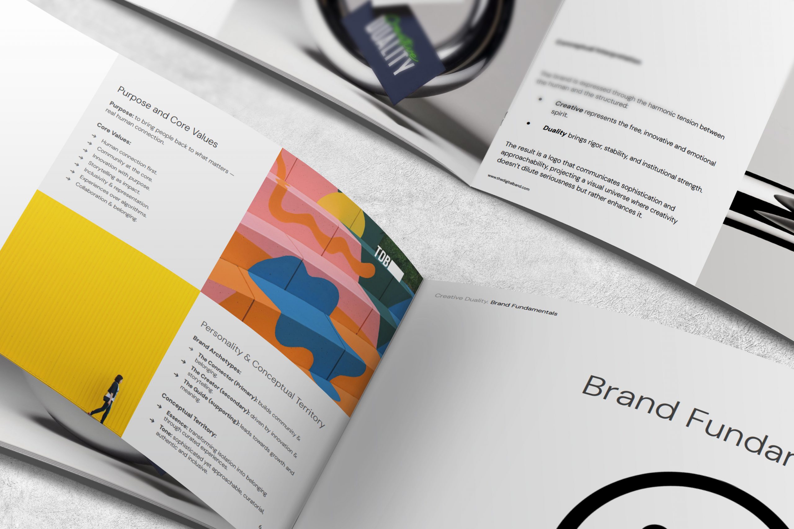
We started from the brand fundamentals. Its purpose is to bring people back to what matters, real human connection, and its essence is transforming isolation into belonging through curated experiences. The personality combines the Connector as its primary archetype, supported by the Creator and the Guide, with a tone that is sophisticated yet approachable, curatorial, authentic and inclusive.
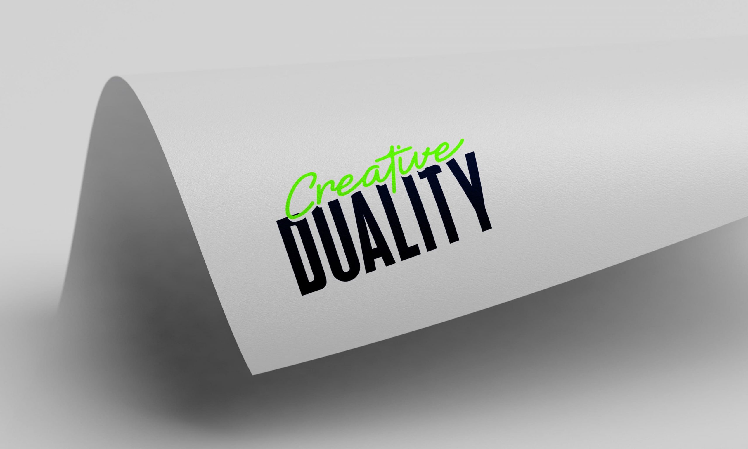
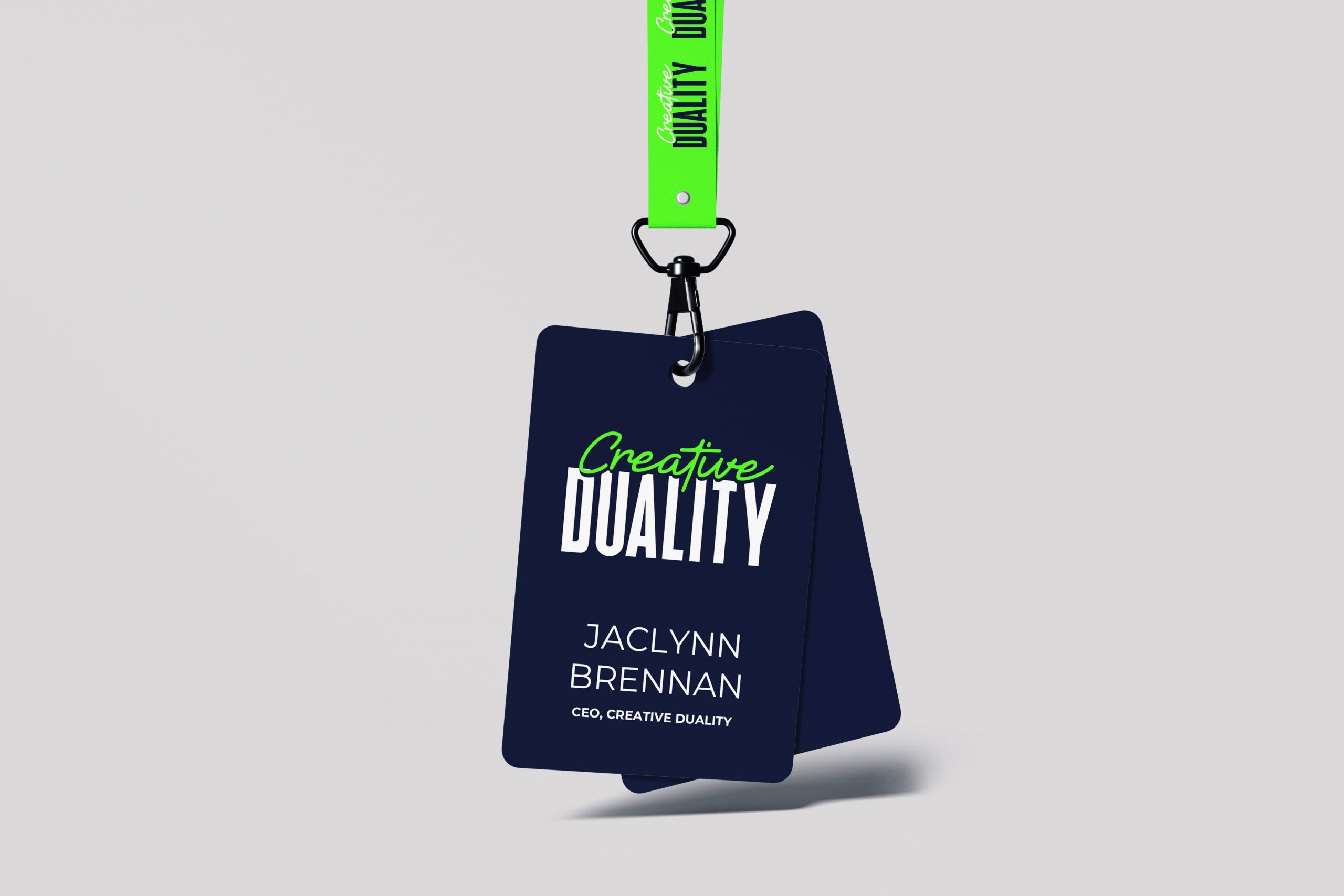
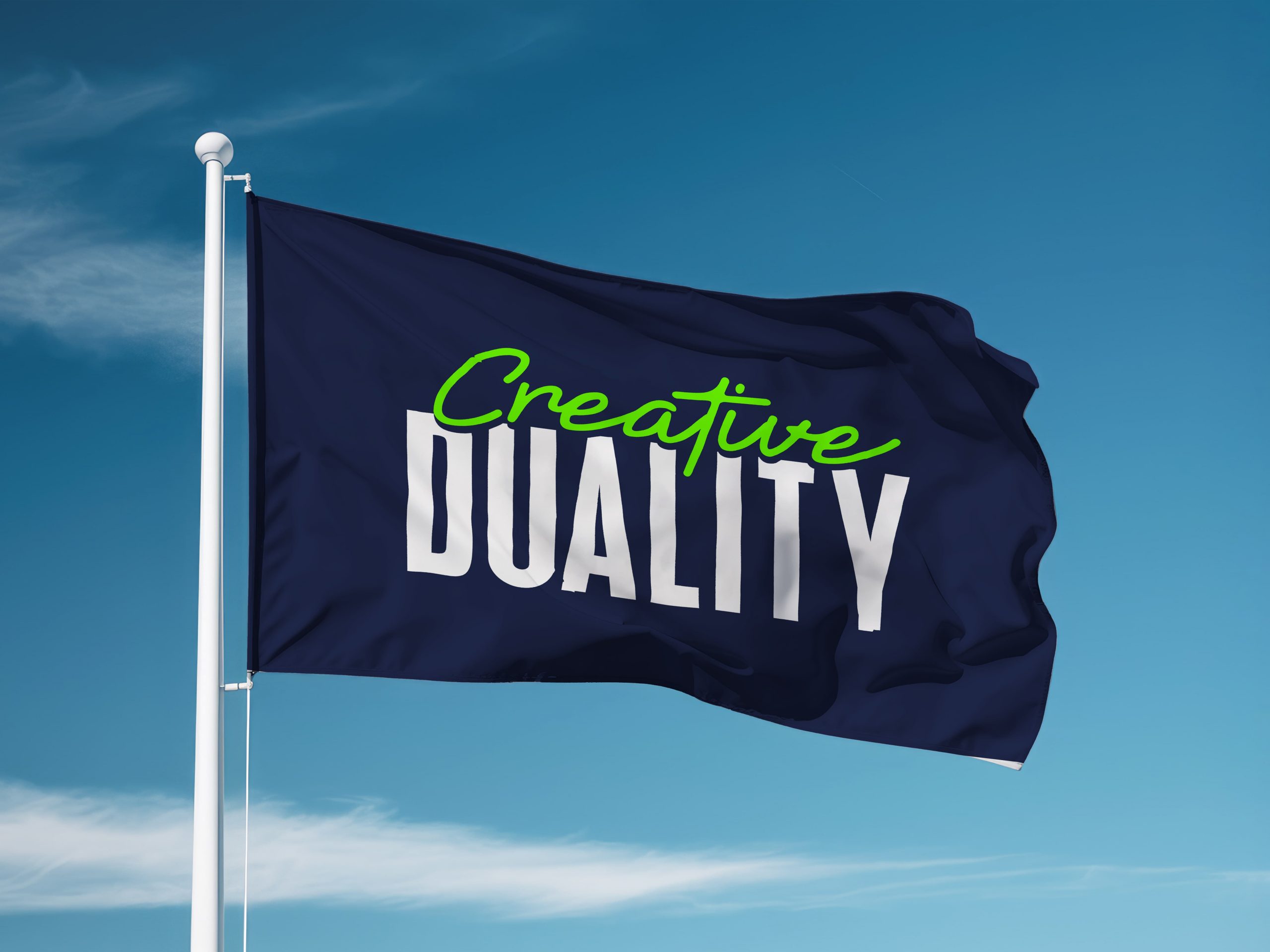
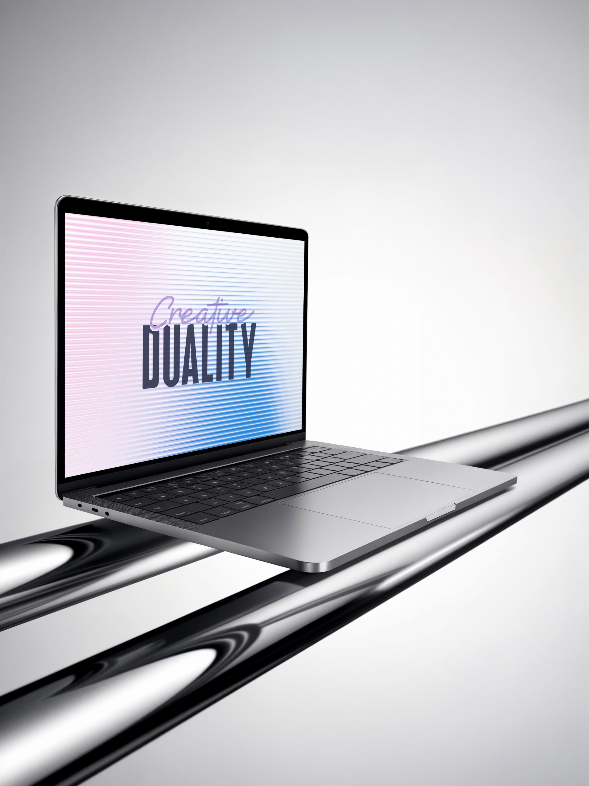
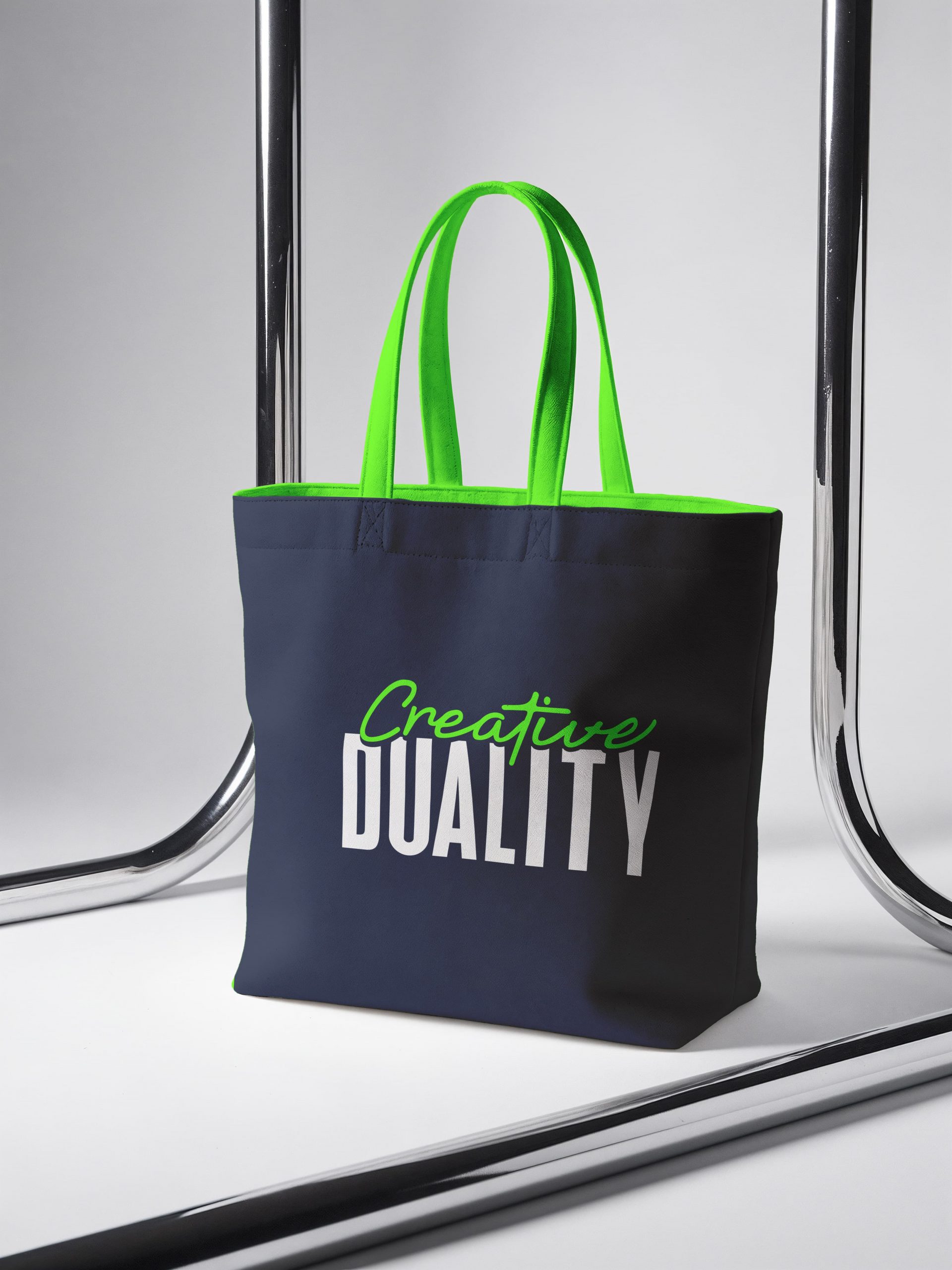
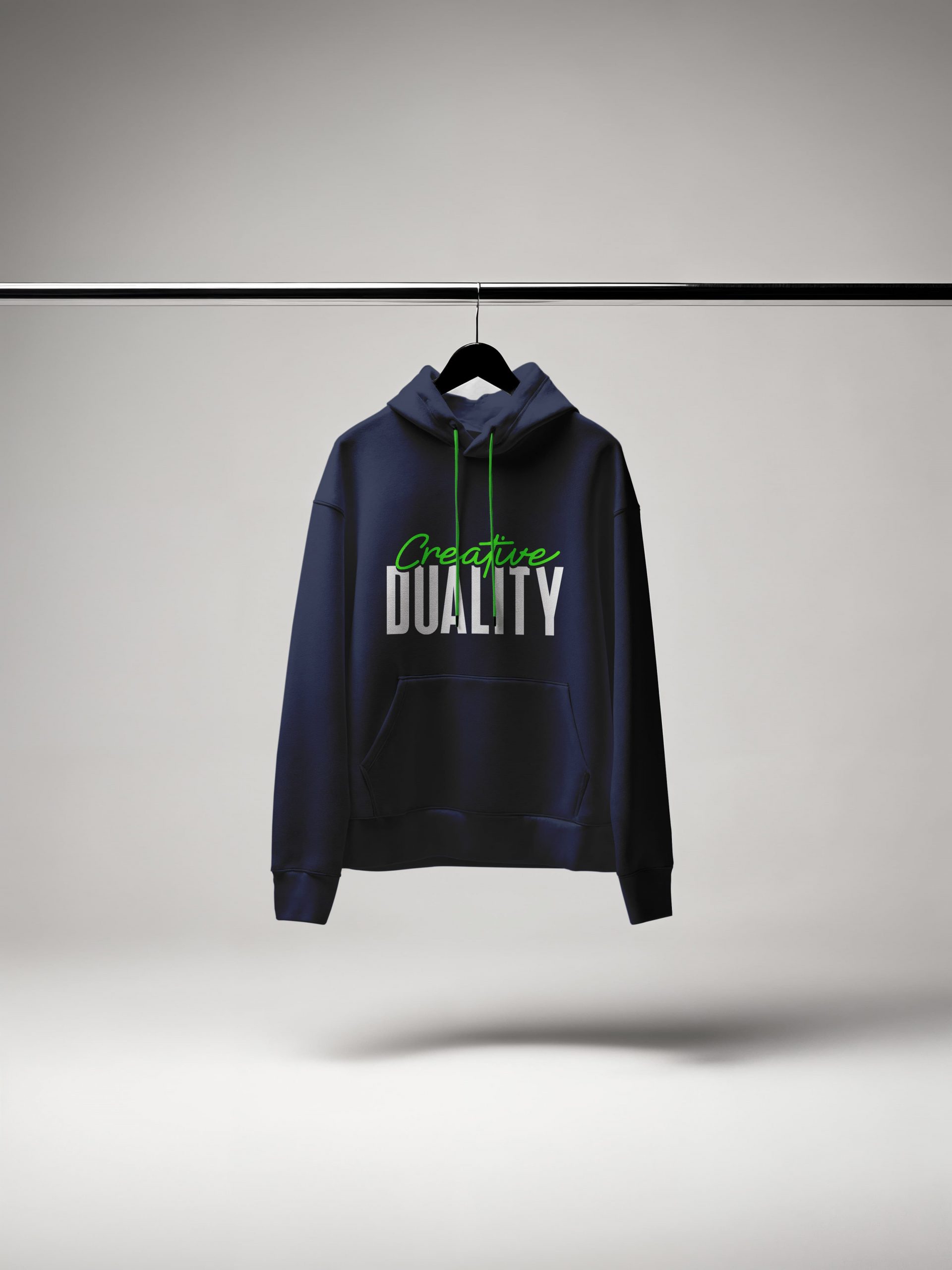
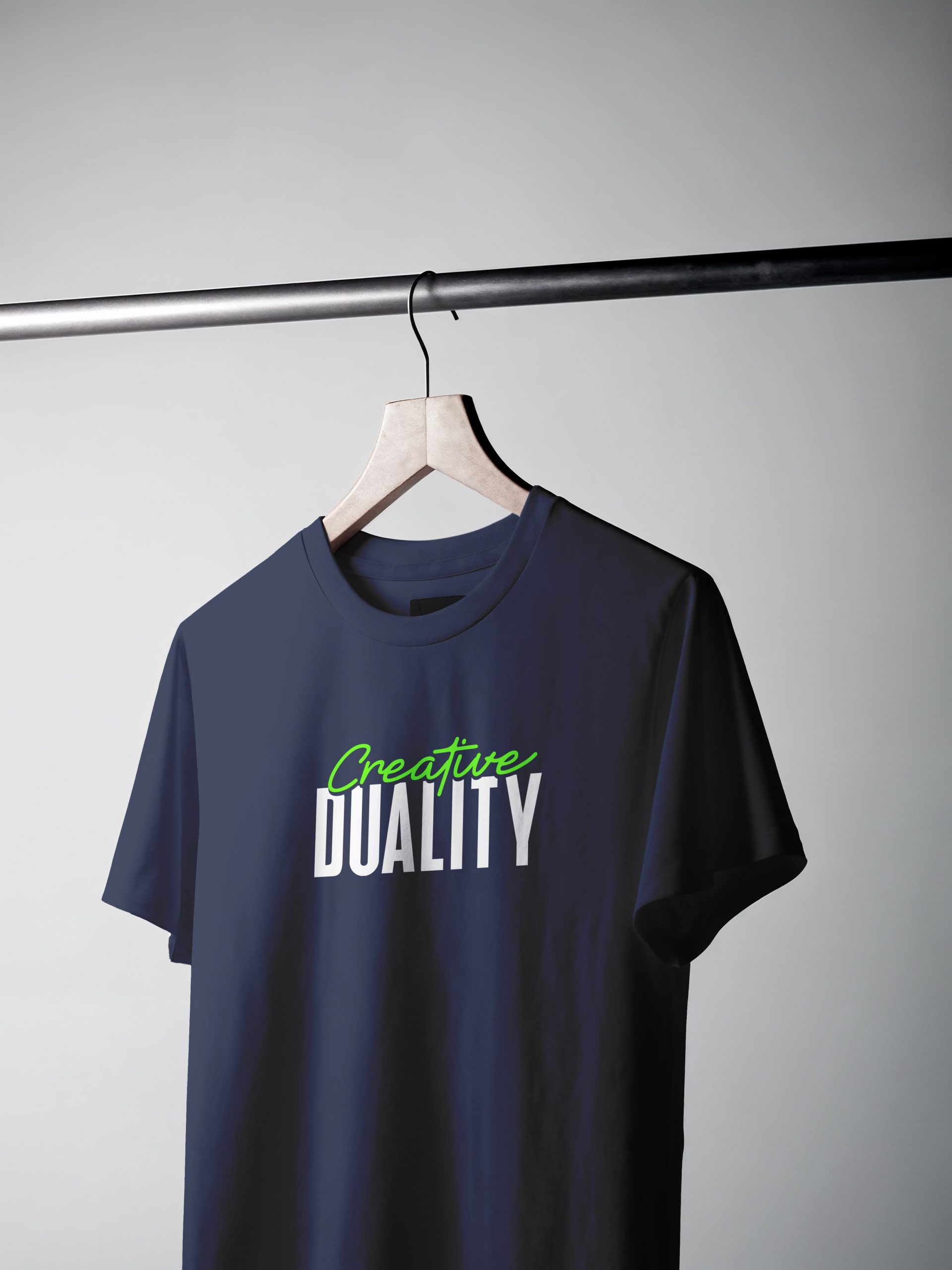
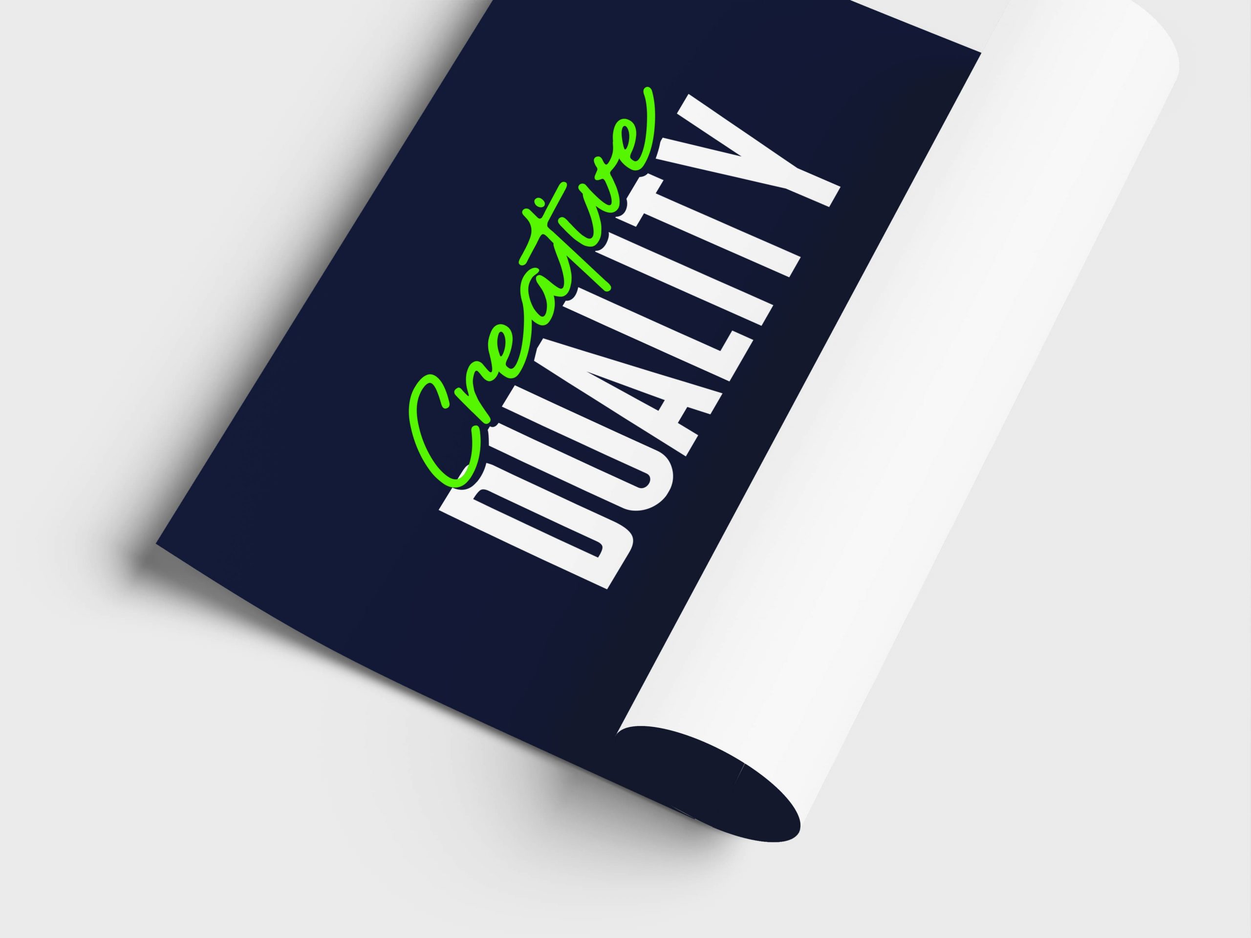
The identity is a play of contrasts that makes the name visible. “Creative” is written in Dongra Script, a fluid calligraphic stroke in vivid lime green that brings humanity, spontaneity and artistic sensitivity. “DUALITY” is set in bold capitals from Dongra Sans in deep navy, conveying structure, authority and trust. Because both styles belong to the same type family, the tension between the emotional and the rational feels harmonious rather than forced. DM Sans completes the system as a clean, highly legible typeface for body copy and digital interfaces.
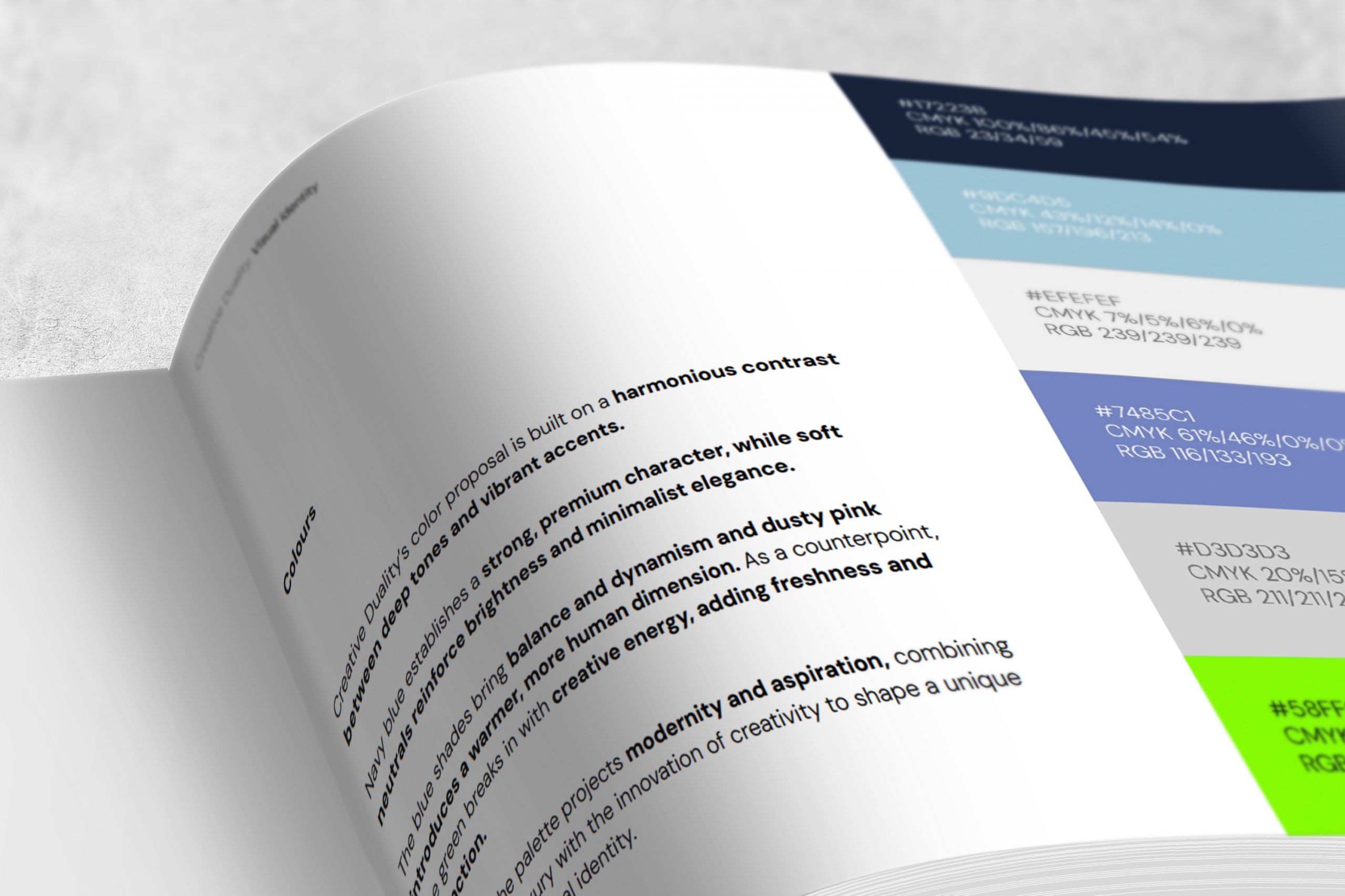
The palette follows the same logic. Deep navy anchors the brand with a premium, serious character, and light blue softens it with openness and modernity. Warm white, medium blue and dusty pink add light, balance and warmth, while lime green breaks in as a disruptive accent of creative energy, used with restraint so it never compromises the system’s elegance.
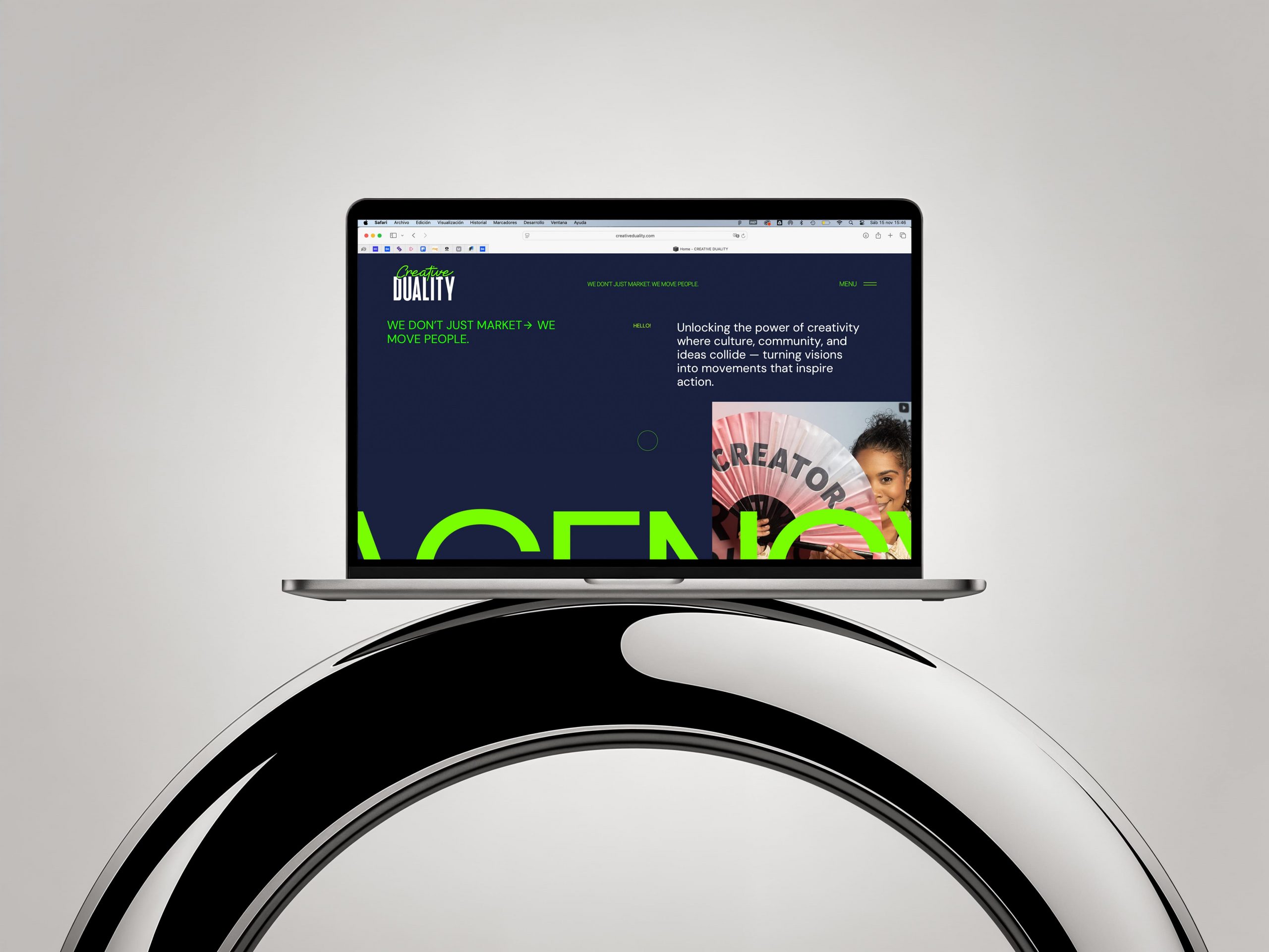
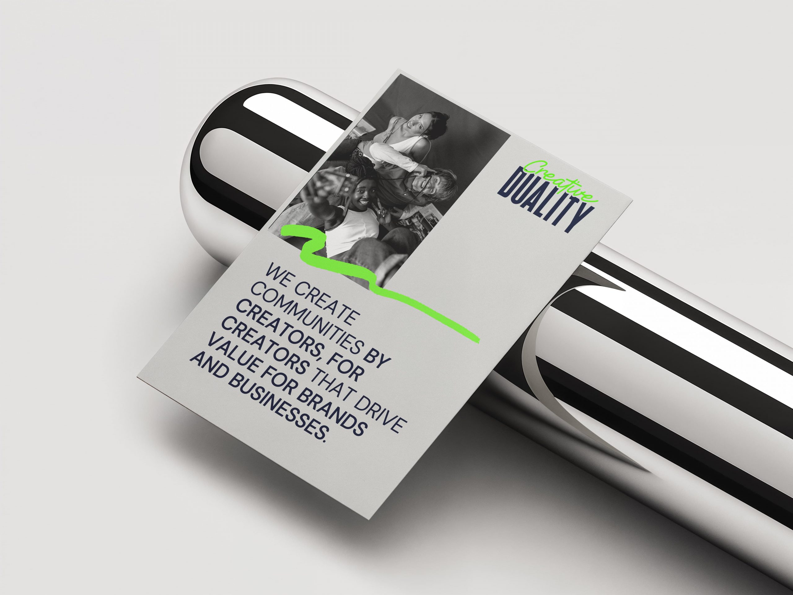
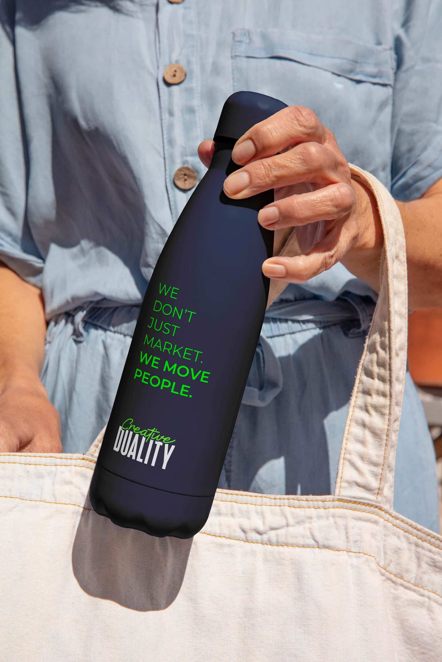
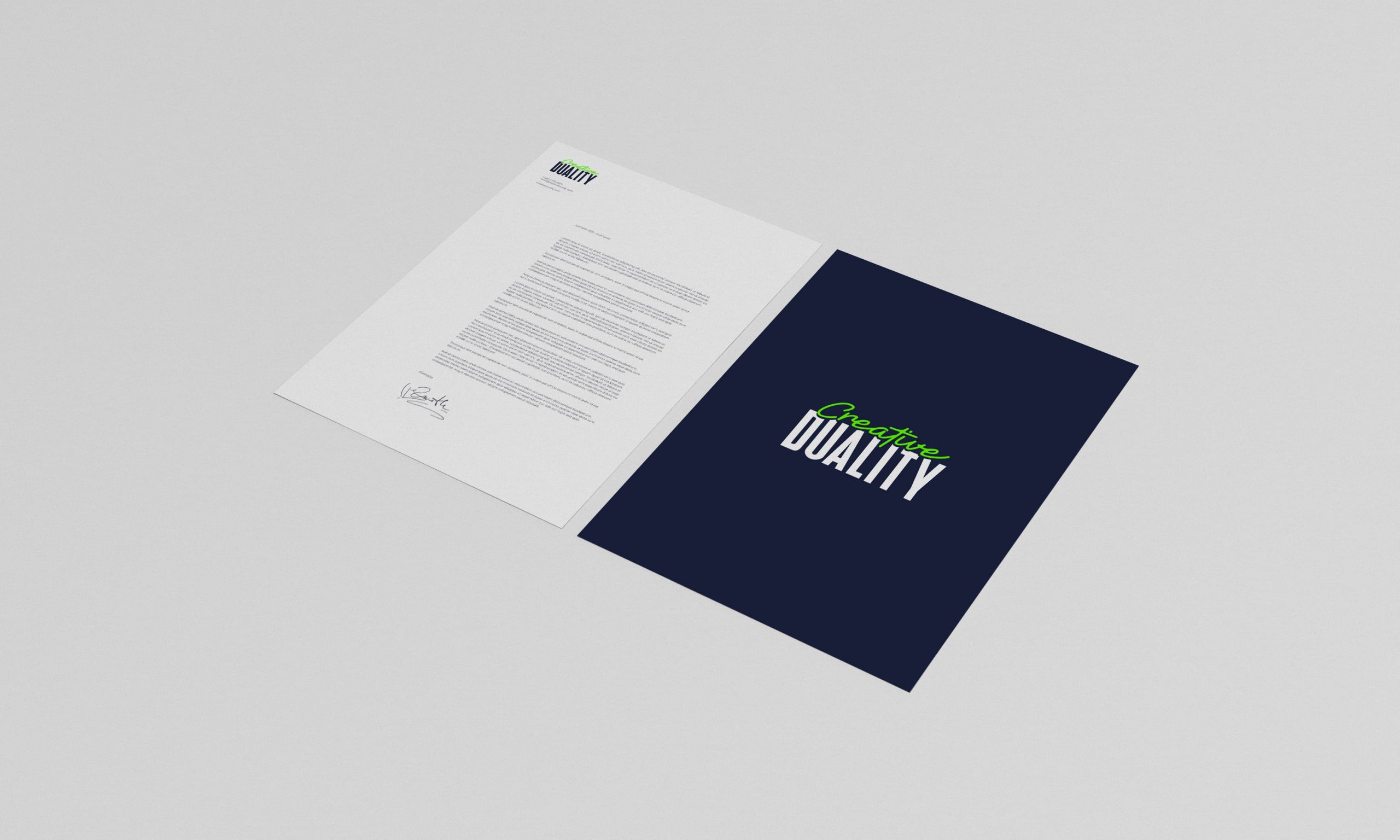
The result is a visual language where creativity does not dilute seriousness but enhances it. It comes to life across the website, brand guidelines, stationery, credentials, flags and merchandise, carrying the agency’s message: “We don’t just market. We move people.”
Selected Shots


Credits
Irene Rubio
Art Direction & Design
The Digital Band
Studio (freelance collaboration)